
There are so many fantastic photographs that make our top 75s each year that this regular segment will feature and briefly discuss 10 photographs from a judging perspective. Hopefully, it inspires you to take some of the examples and ideas set by last year’s great photography and apply it in new and interesting ways to your own photography.
Today we’re going to look at some great examples of composition being used to elevate an image. That is how elements within the frame are placed and how they relate, how they are cropped, create balance and more.

Ross Duggan uses composition to not only document someone using space, but to transport us around what becomes almost an architectural photograph full of texture, pattern and repetition. The eye is drawn to the bright white railing at the bottom right third and this carries you to the space the person is residing in through the colliding curves. The marks created by dripping water near the top of the frame also lead you back into this space with vertical lines. A well-seen shot.
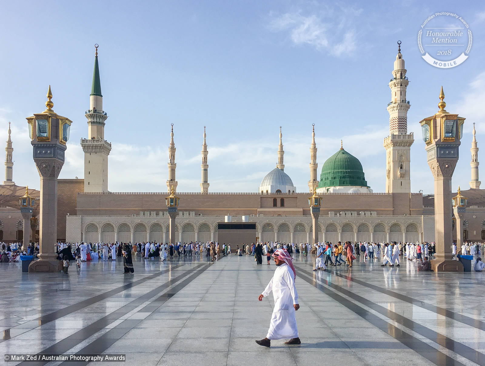
The spires of this sacred place, most likely in the Middle-East and related to the time of Hajj is placed symmetrically in the frame. There are very strong leading lines in the foreground leading you to the building, but there is compositional power in the foremost man due to his white clothing drawing the eye and his placement. The placement is deliberately not centred like the rest of the composition to give it more sense of movement and allow you to look into the spaces behind.
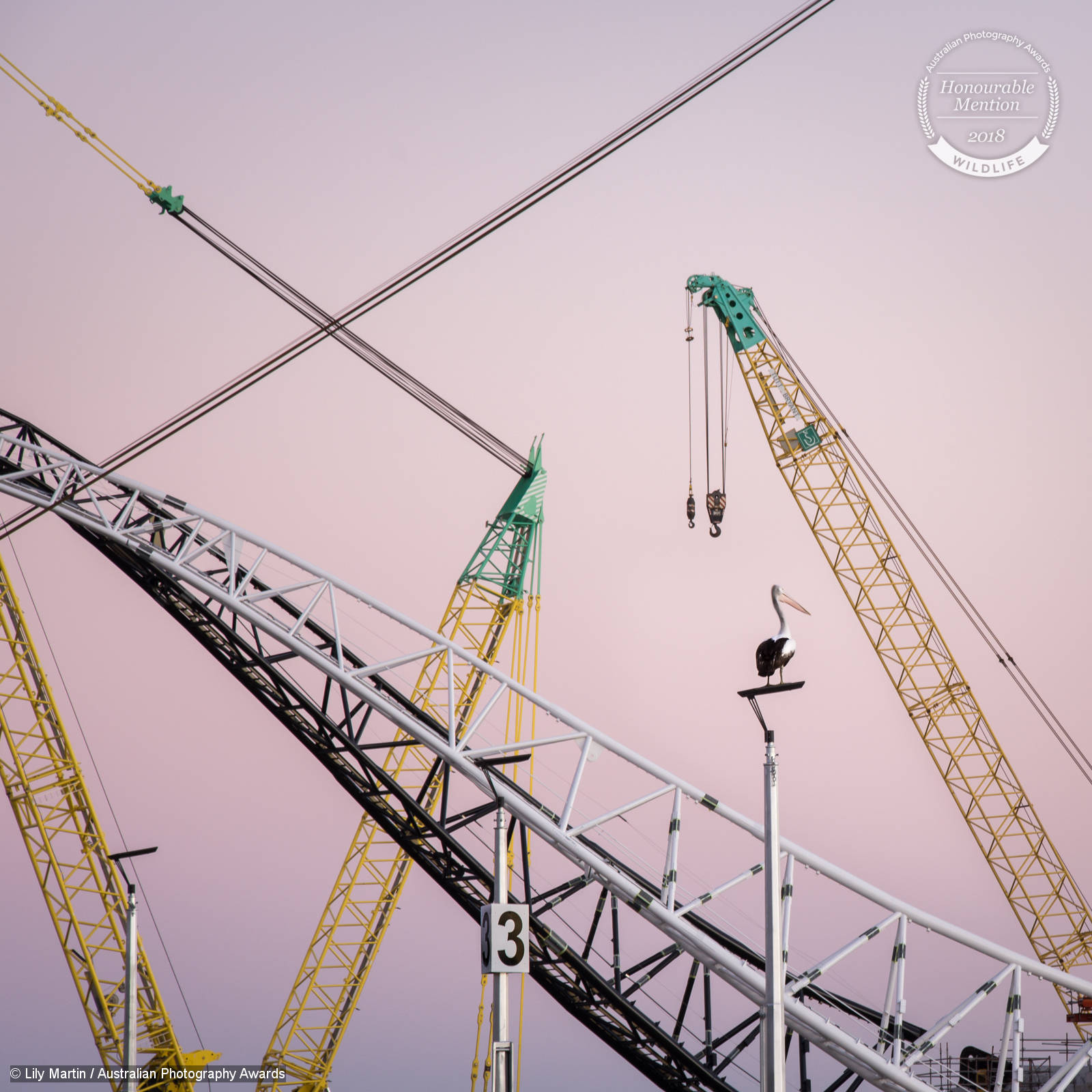
This photograph of a pelican framed by cranes is possibly one of my favourite examples of composition from last year’s competition. The placement of the pelican off-centre on a strong vertical line, sitting within its own space in the sky is very deliberate. The interactions of black, white and yellow lines are very graphic and give the scene a sense of contemporary art. Lily has also waited for the perfect time of day to provide us with this beautiful graduated pink and purple sky.
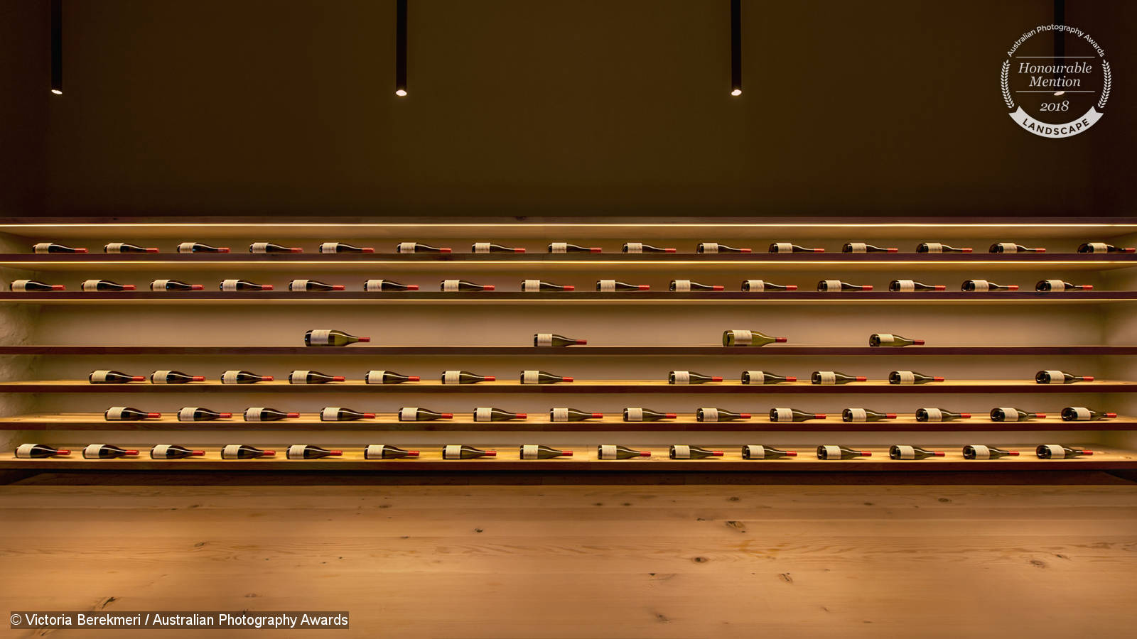
Who would have thought a photograph of wine storage could be so interesting? Victoria has used pattern and repetition very deliberately in this composition to create interest and having the perspective show the top of wine bottles on left, and base of the bottles on right within the straightened frame provides a sense of movement to a subject which is very static. The floor and lighting above also provide a sense of space for this interest to sit within, allowing us to take it in without it feeling too claustrophobic.

While Horsehead Rock in NSW is a very popular photography location, Heesoo Chung has done a few things very well to elevate the popular location further. The use of the rugged rock in the foreground carrys you through to the horses head and allows it to be prominent but without it being, well, in your face. This is also supported by the early morning light touching the face of the horse-looking rock. The use of star trails, circular here due to looking South while photographing them, leads you to the head and provides a dramatic element that supports the scene.
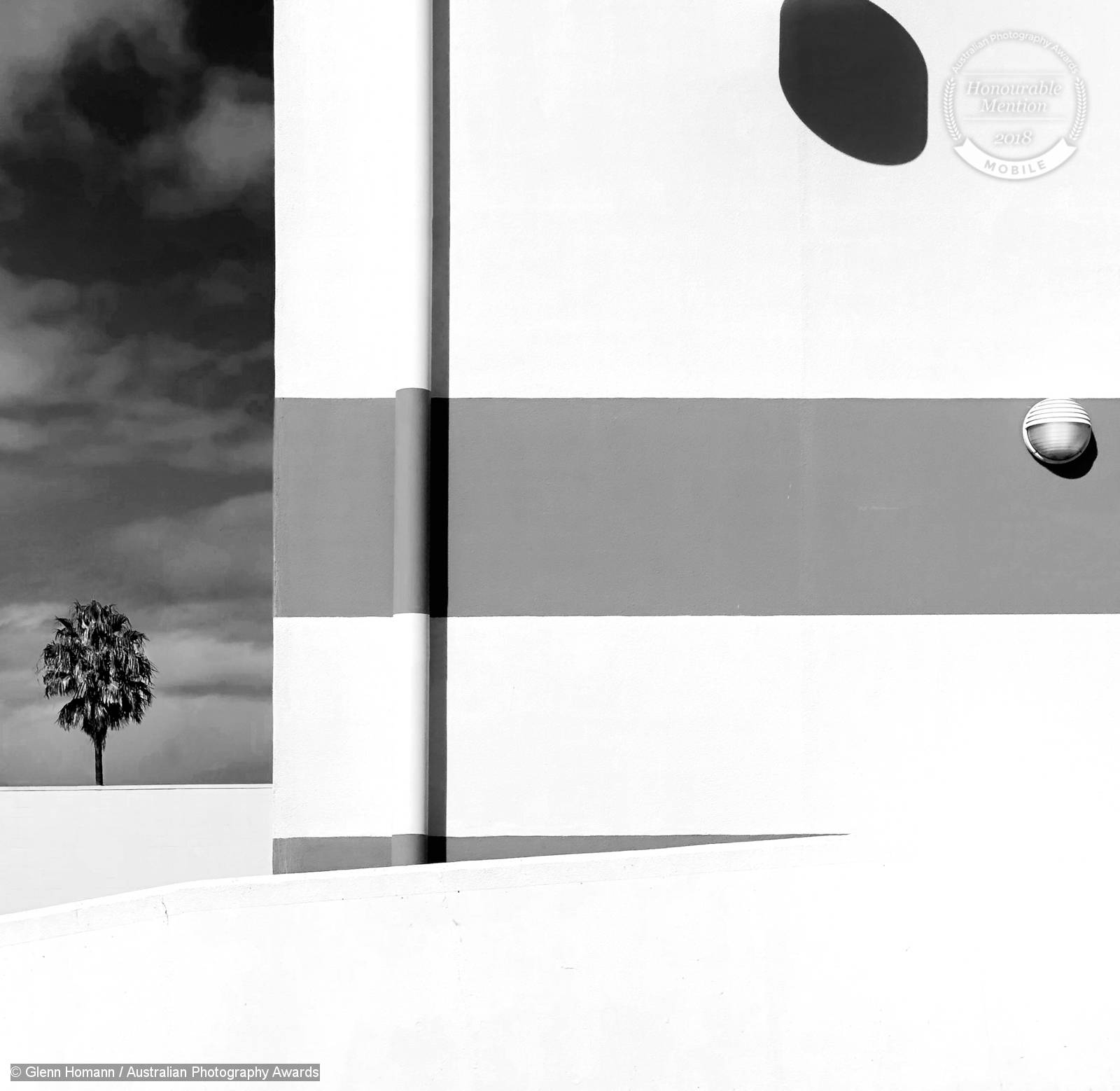
This photograph is so incredibly well seen and quirky. It’s the kind of thing hundreds of people would walk past without noticing, and yet Glenn Homann has used the hard shadow in the top right as a balance to the tree in the bottom left so deliberately. Also incredible is the retaining of texture in the white areas of this photograph despite Glenn using a mobile to capture it. This level of craft led to him placing 21st in Mobile with this shot, along with other successes in the competition and category!
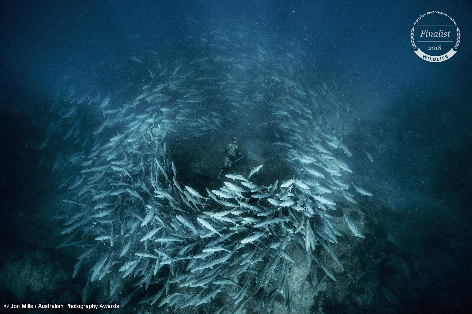
This photograph has some incredible impact. The decision to move further back, allows Jon Mills to capture a grander scene of the entire school of fish reacting to the lone diver. While the diver only occupies a small portion of the photograph, they are given a huge sense of prominence through the framing of the fish and the highlights on the nearby fish that draw you into this space quickly.
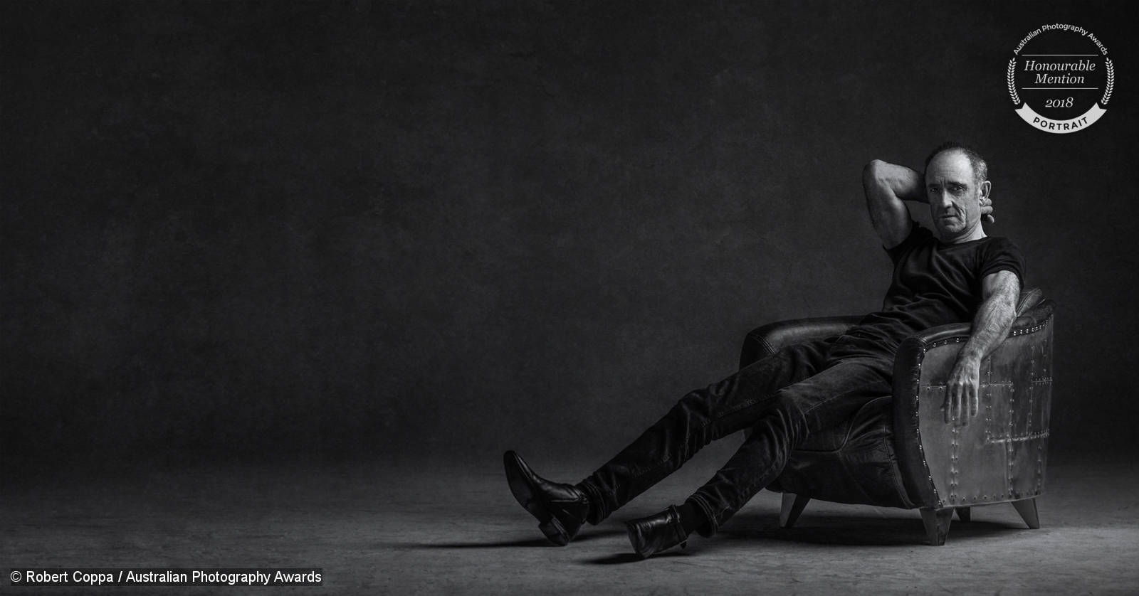
The composition and crop of this portrait by Robert Coppa shows so much intention. It would be easier to shoot a classic full-body style shot or get closer to this man’s hands and face to tell his story. Instead a panoramic framing is used with intentional empty space. It allows space for the viewer to come to this individual and enjoy their strong presence but also a slight feeling of uncertainty. Like all of Robert’s work the wardrobe of black clothing and the industrial chair are well-considered and followed up by simple but perfect lighting to bring out texture and form that supports the character of this gentleman.
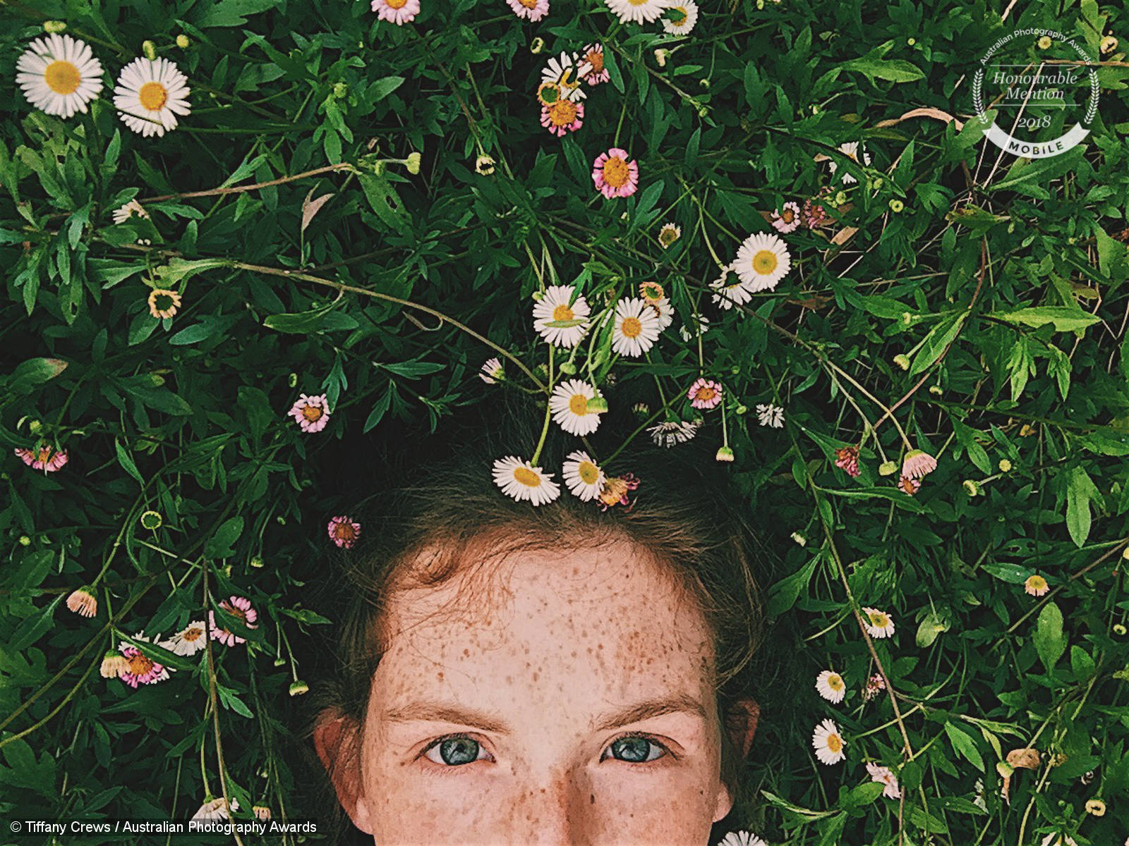
This photograph uses cropping in a completely different way to effect. This mobile photo from Tiffany Crews intentionally crops out the face just below the years to bring the viewer’s focus on the beautiful blue eyes of the subject as well as combining with the grasses and flowers to create more of a playful and younger feel.
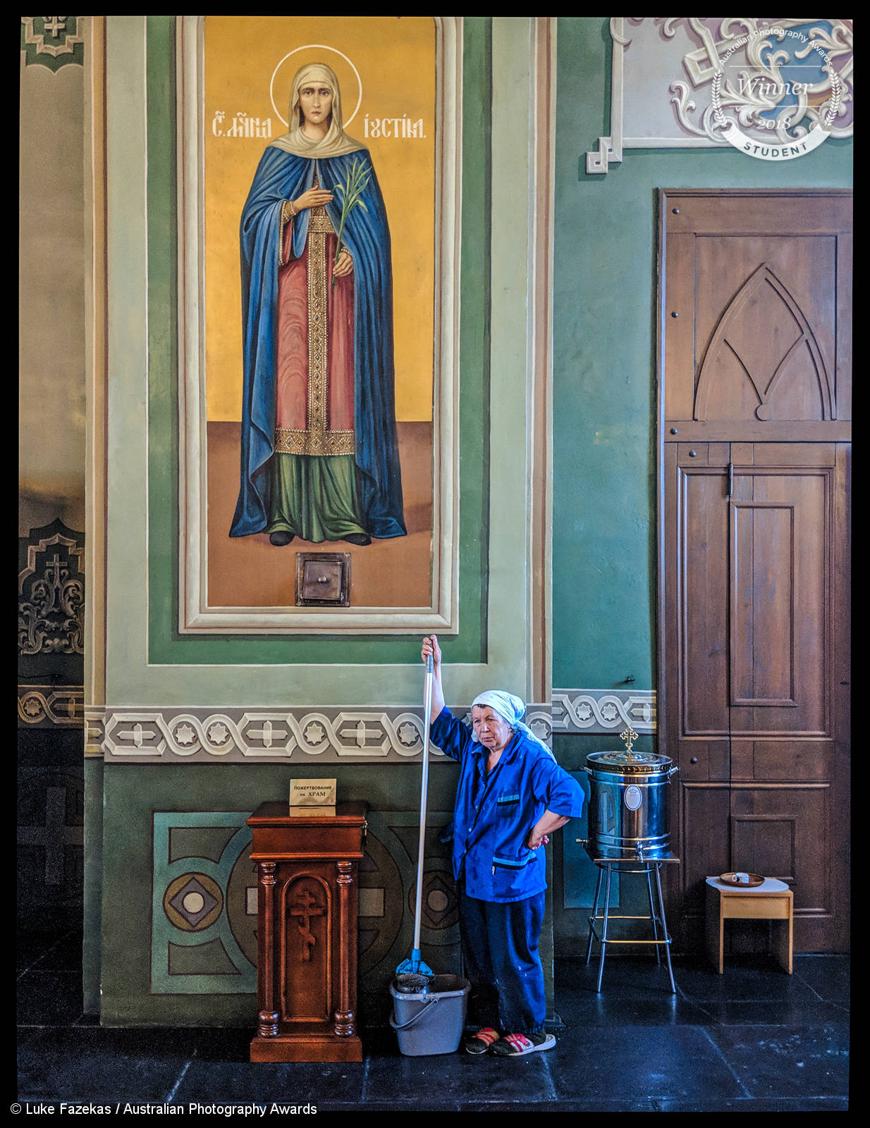
Luke Fazekas was our Student winner and Mobile runner up in 2018 with this brilliant moment captured while travelling. Space above the woman has been used expertly to show the juxtaposition and comparison between the cleaning staff and Mary the religious figure, helped by the draping blue clothing and covered heads of each. Vertical lines are used well here to keep you in the frame, with a hard line on the left and the door on the right providing weight that directs you back into this juxtaposition as you look around the frame.
I hope you’ve enjoyed these ten photographs and my brief discussion on each! Feel free to share your thoughts on this post or share some of your own compositions in our Facebook Community Group!